Fresh Brew
A comprehensive solution designed to streamline and enhance a cafe's order management process, whether it's ordering in-store or for takeout
Design | Feb - March 2023

Problem
The app addresses the issue of time constraints faced by people on the go. Traditional coffee purchases often involve long wait times and complex payments.
Solution
To create a comprehensive app that will allow users to place advance orders, enabling those on tight schedules to skip in-store lines and payment hassles, ultimately saving them time.
Introduction
The Coffee House app introduces advanced ordering, empowering users to plan their coffee choices in advance. This eliminates the need to wait in lines or handle payments at the counter. By leveraging technology, the app optimizes sales and reduces in-store waiting times, benefiting both customers and coffee shops.

User Research
To gain insights into the coffee-drinking habits of busy individuals, I conducted an online survey with over 25 participants. Key insights revealed:
arrive late to work due to their morning coffee ritual
want customized coffees and good recommendations
is on average, what a user spends per month on coffee
would like to preorder their coffee
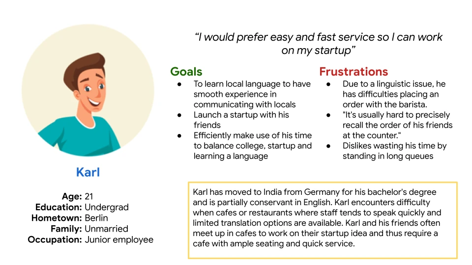
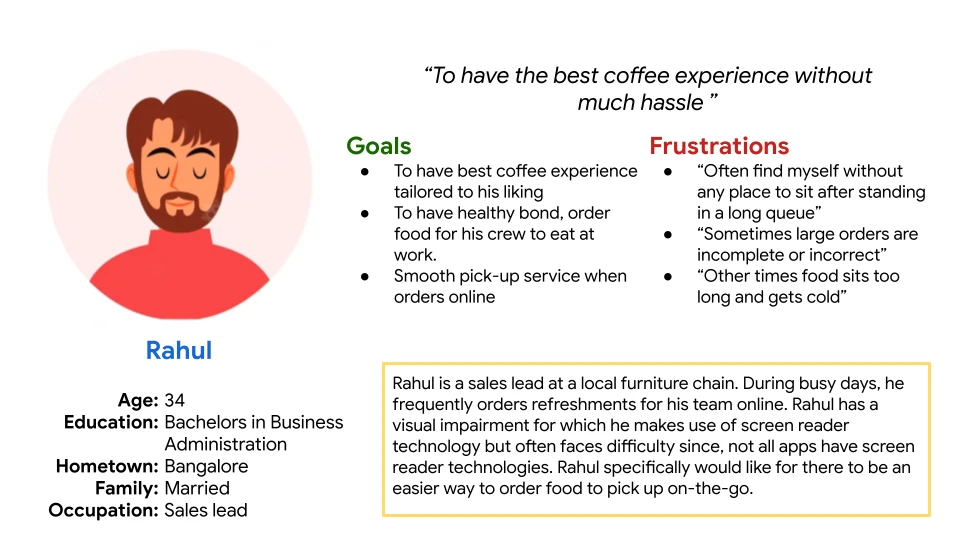
User Persona
Based on the insights gleaned from the user survey, I developed several user personas to represent the diverse needs and characteristics of my target audience.
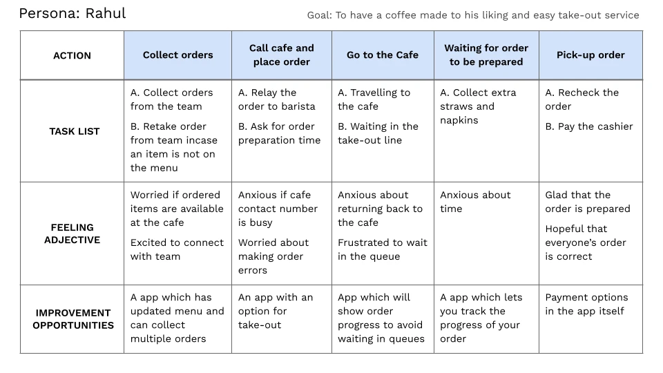
User Journey
Mapping user journey is crucial, as this process allowed me to visualize the entire coffee purchasing experience from the user's perspective, identifying key touchpoints and potential pain points. By understanding the user's flow, I could design a seamless and intuitive app that caters to their specific needs and expectations.

Competitive Audit
I conducted comprehensive competitive audit to understand the landscape in which this app will operate and to gain valuable insights into the strengths, weaknesses, and strategies of both direct and indirect competitors.
I chose Starbucks and McDonalds for their prominent position in coffee and quick-service restaurant market. While Decathlon and Chroma to expand perspective and to explore strategies in local marketing.

Insights
Feature early language change for user accessibility
Implement a simple signup process
Clear price breakup during customization of orders
In-App payment options
Implement effective filters for orders
Key Features

Customize and Save order
Transcribe speakers and record presentation

Recurring orders
Set a order to recur at a specific time, and receive a notification for a one-tap reorder

Takeaway
Opt for takeaways and add specific instructions for your order

In-App Payment
For seamless payments, additional discounts and offers
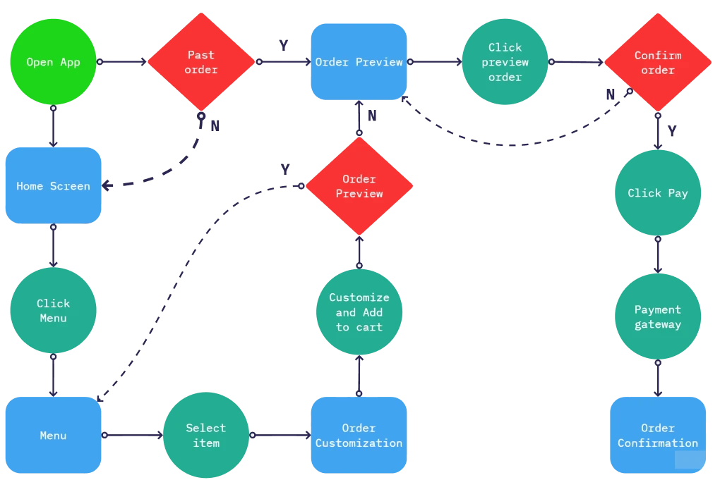
Task Flow
Before jumping into the sketch, I first need to find out the flow and process in which way the user will go through and interested, that means creating a roadmap to achieve the task successfully.
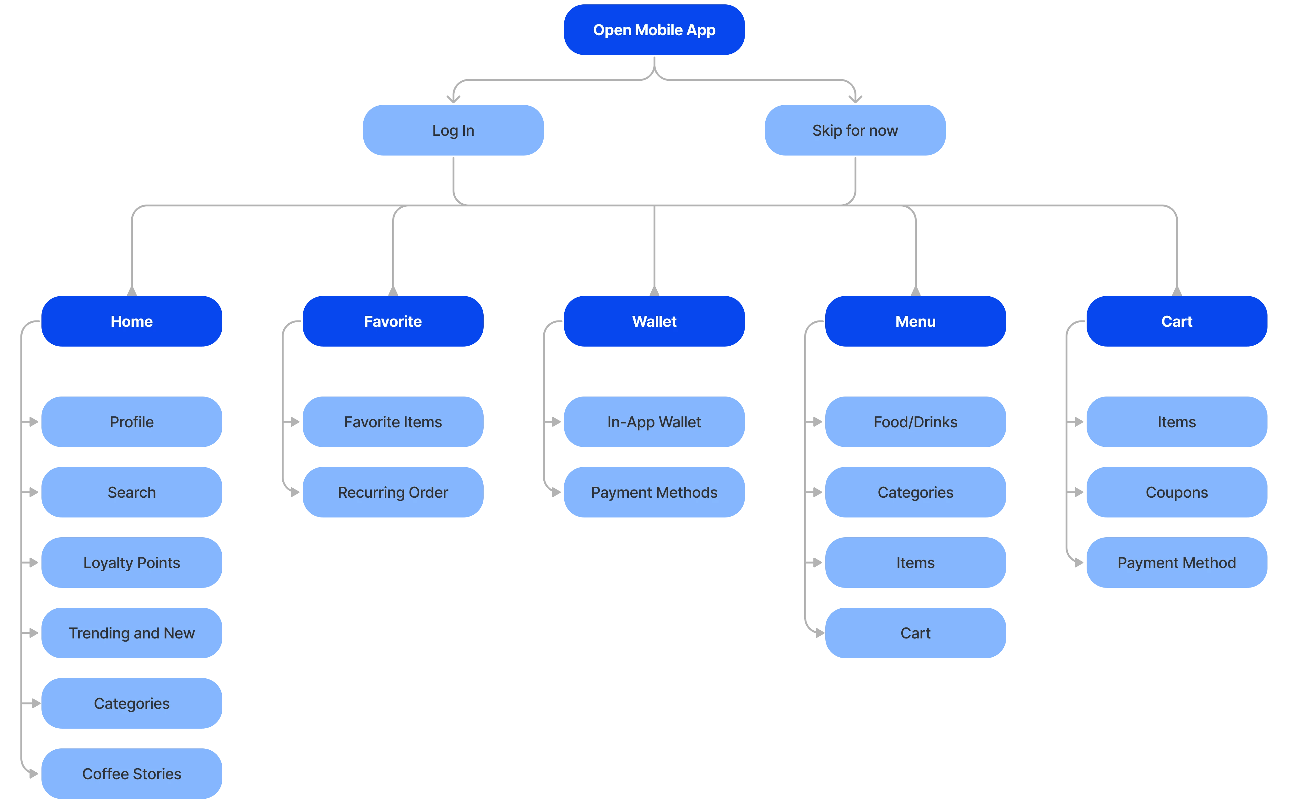
Information Architecture
Building on the task flow, This is the information architecture for the app.
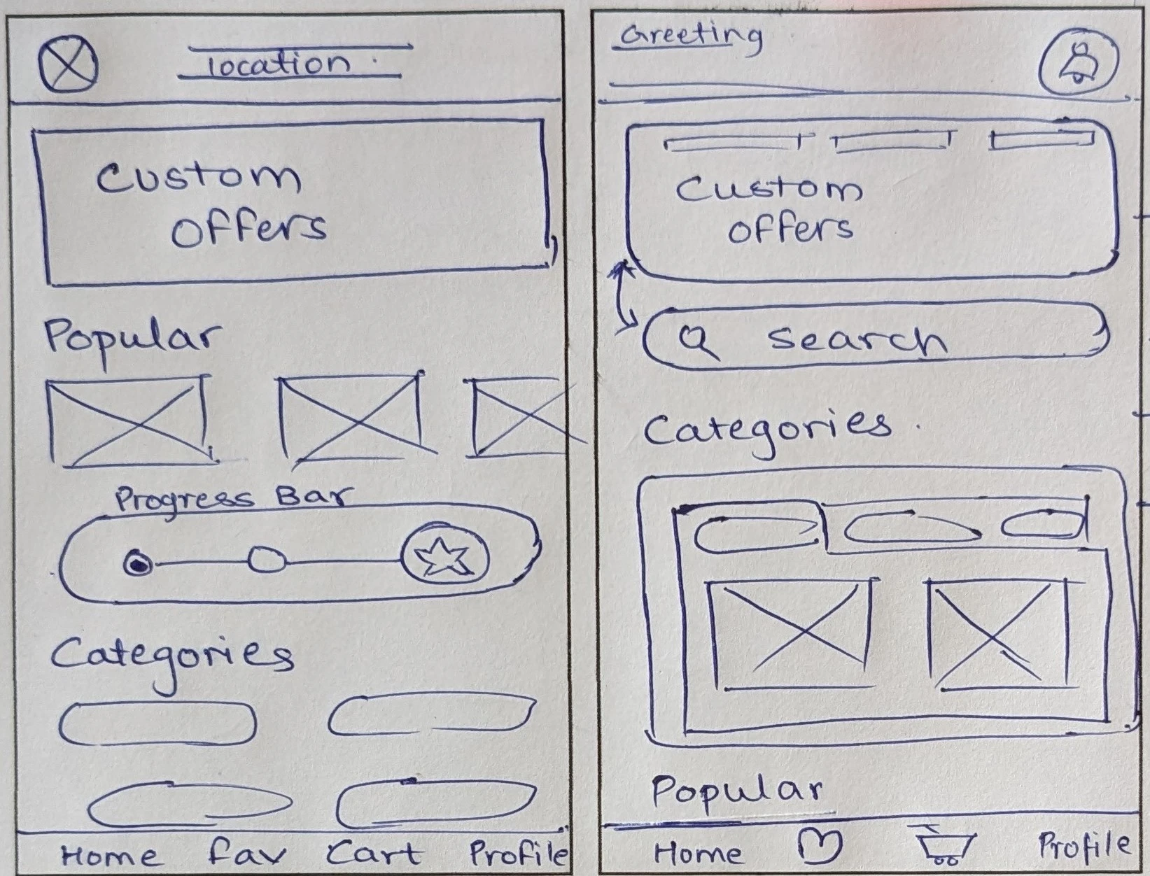
Paper Wireframes
I gathered information from research and compiled it on paper to ensure that it would provide users with the necessary content. It is the most effective way to generate multiple ideas and solutions in a short period of time.
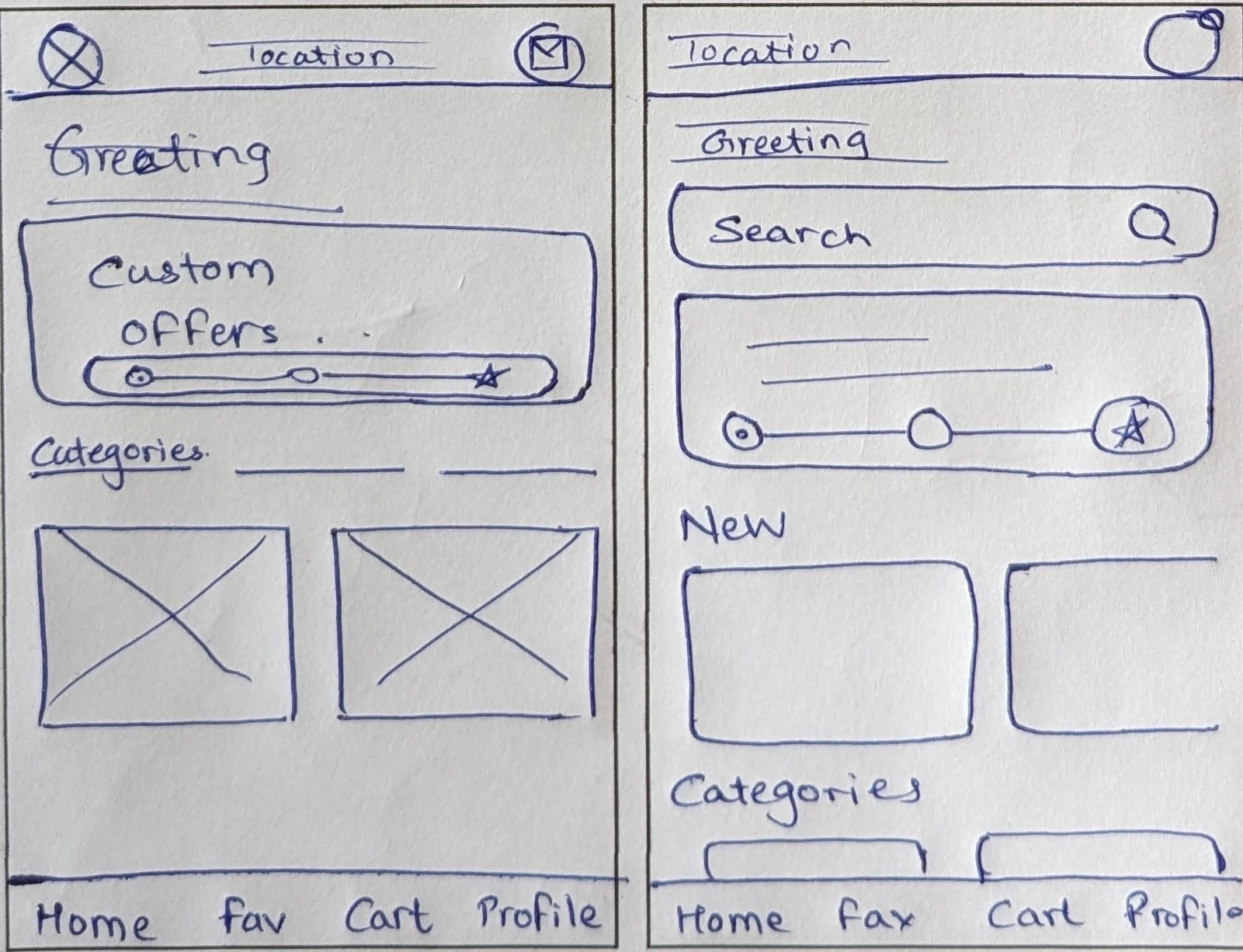
Low Fidelity Prototype
I gathered information from research and compiled it on paper to ensure that it would provide users with the necessary content. It is the most effective way to generate multiple ideas and solutions in a short period of time.

Usability Testing
5 participants, each completing the task of ordering on their own. Participants include individuals who frequently visit a café, both alone and in groups. This demographic encompasses full-time and part-time workers, students, and parents.
Research goals: To determine whether users are able to complete the core tasks within the app.
Round 1
Affinity Mapping was done in order to help organize and analyze the feedback from usability testing
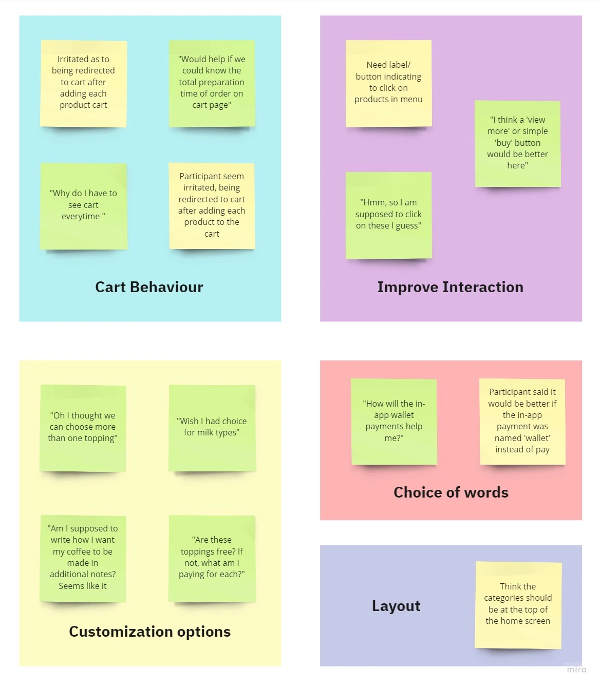
Insights:
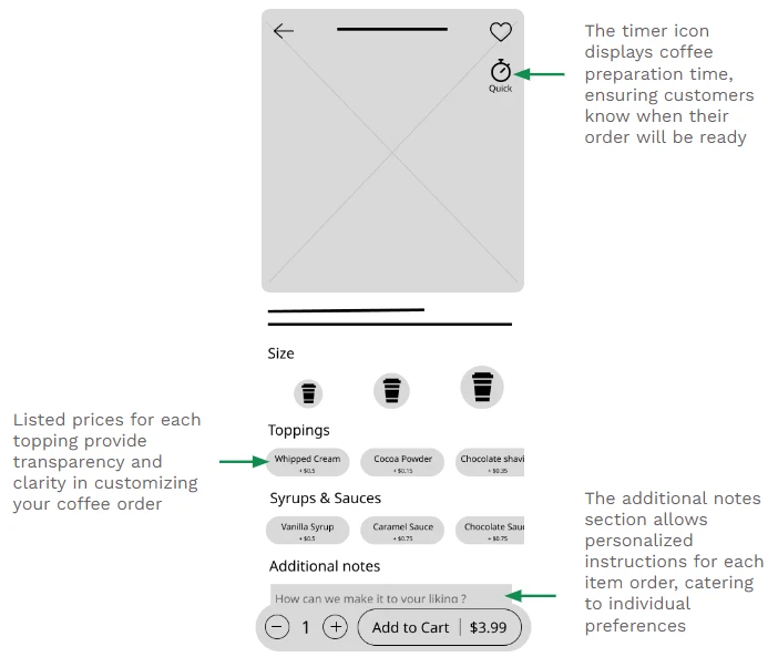
Users want extensive topping choices with clear pricing
Word ‘Pay’ was confused with checkout payment than in-app payment
Users prefer staying on the same page than to be constantly redirected to cart, making it easy to explore
Round 2
Usability test on High Fidelity prototype
Insights:
Recurring order indication could stand out more
Spacing between elements should be consistent.
Iterations
Mockups were improved from the insights from usability studies

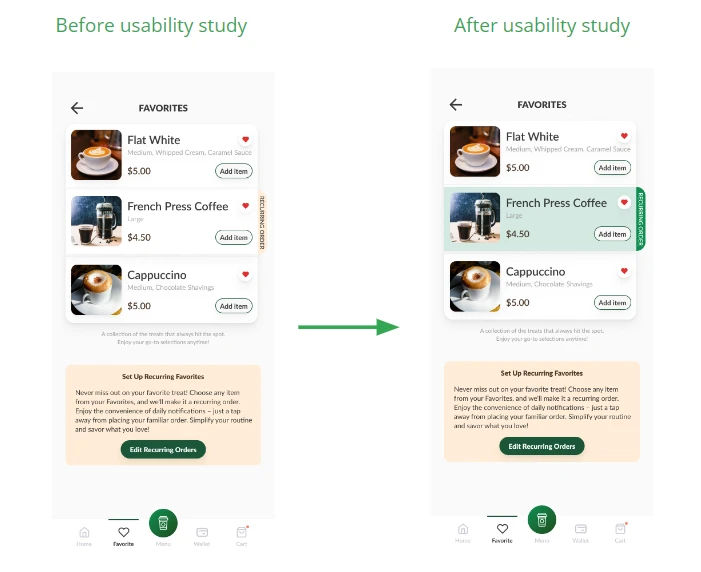
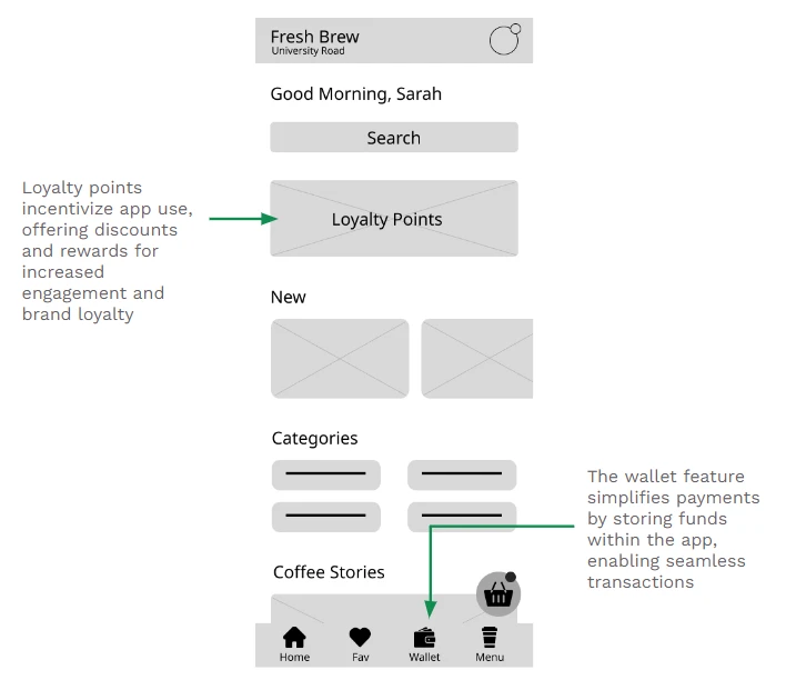
Final Designs
After analyzing and prioritizing the user feedback, I iterated over the design and updated the prototype. Below is the final High Fidelity prototype of the app, Fresh Brew.
Path 1: Placing an order for takeaway
Path 2: Setting a favourite order to recurring